


Coventry University Capstone Project
Sight-Aid
INTRODUCTION _______________________
OVERVIEW _______________________
SECONDARY RESEARCH
_______________________
DESIGN ITERATIONS
_______________________
BRAINSTORMING
_______________________
COMPARATIVE ANALYSIS
_______________________
BRANDING
_______________________
DESIGN RATIONALE
_______________________
PERSONAL REFLECTIONS
_______________________
INTRODUCTIONMy role
1/ Led a team of 7 in designing user flows, branding, and visual designs for the Worldwide Learning Innovation Studio’s student networking platform, which helps students discover their path, develop real-world skills, and build their network; resulting in project adoption and release
2/ Conducted intensive user research on the transition from high school to college to facilitate academic growth
Duration: 6 months; Tools: Adobe XD
OVERVIEWThe problem
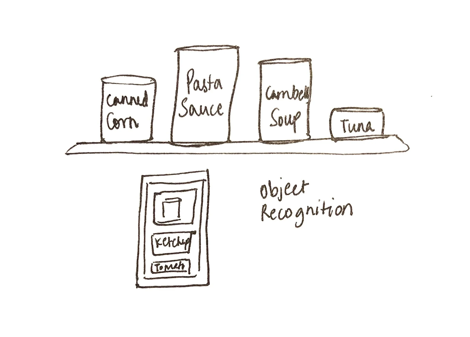
The elderly and visually impaired community depend on the sighted to assist them in simple every day activities like object detection, image identification and reading text. How can we help me somewhat independent through the use of an accessible app?

The solution
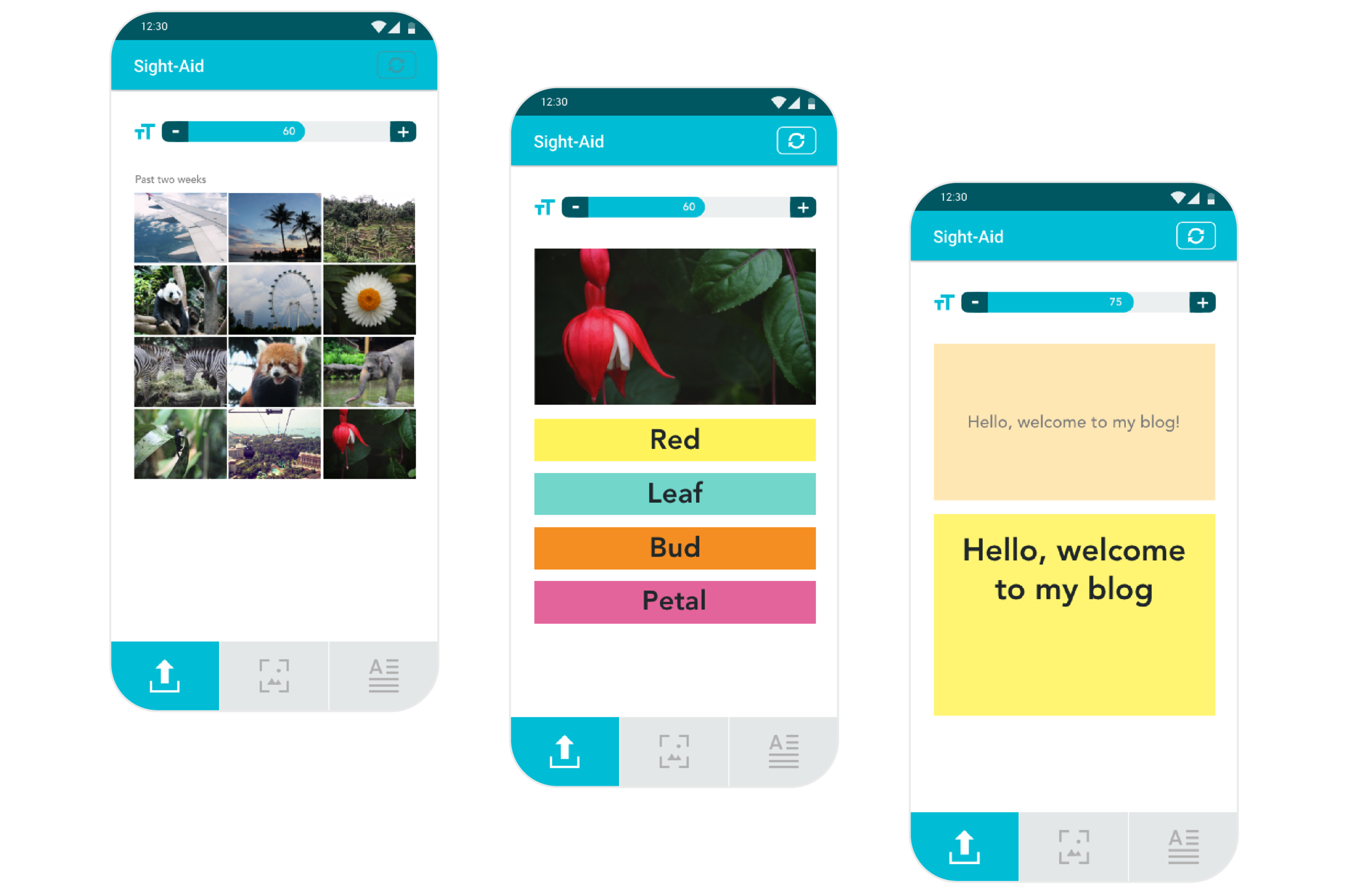
This mobile application aims to help the visually impaired by helping to identify objects and aid in reading text.
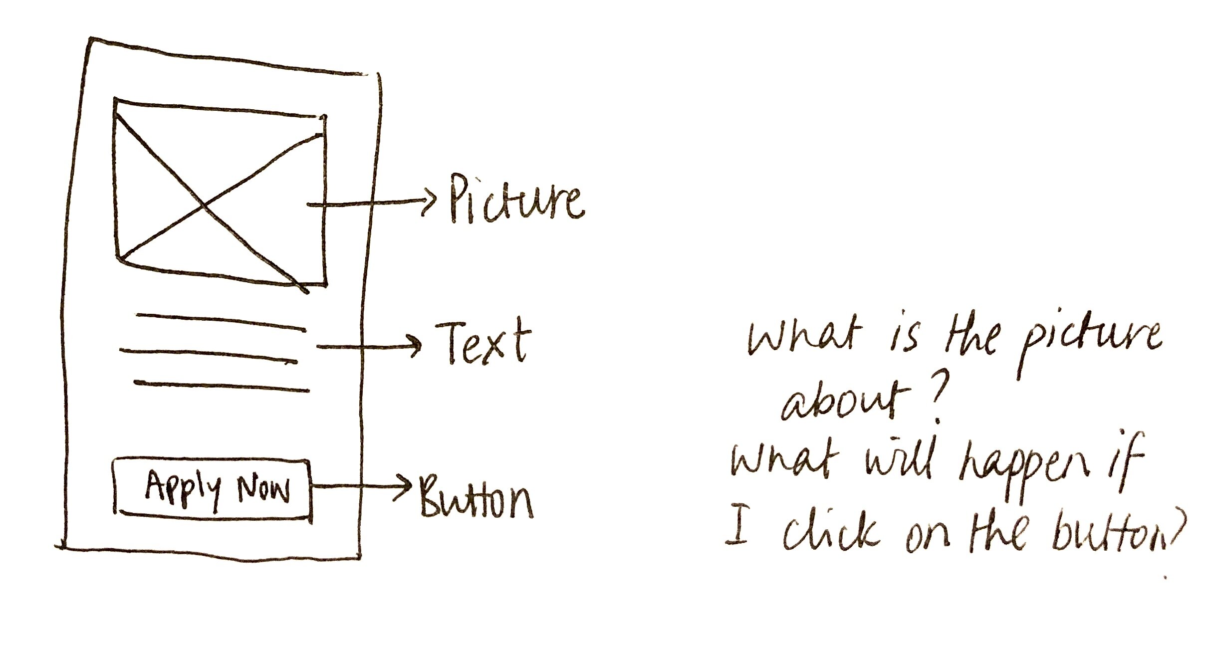
01
Upload Image From Gallery for Object Recognition
Click the upload image icon on the bottom navigation
Upload image from gallery (can be a WhatsApp forward, image clicked, social media download, etc)
Select any description blocks to know about the image

02
Click Image for Text Recognition
Click the text recognition icon on the bottom navigation
Click an image of the text using the in built camera
Select the text block to know what’s written in the image
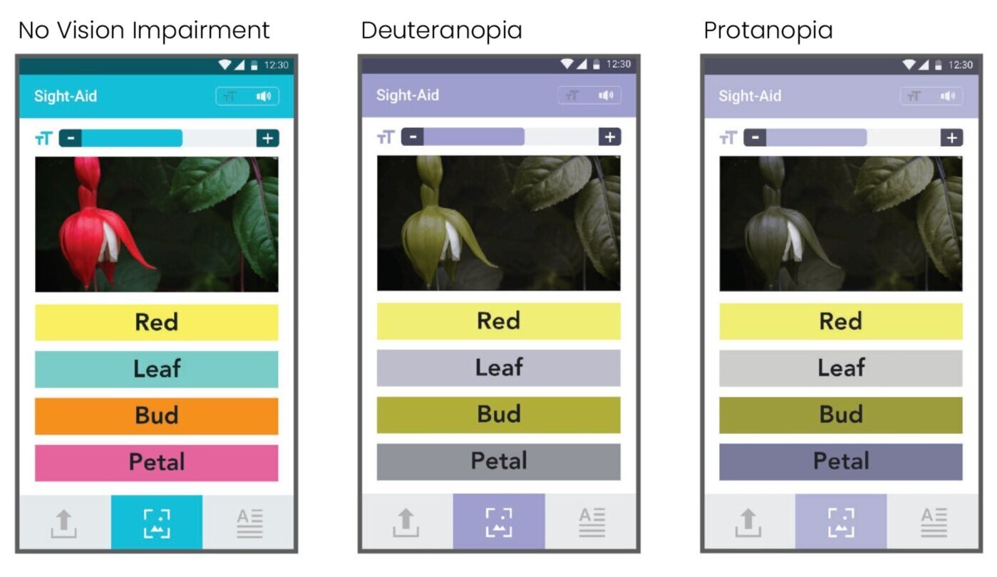
SECONDARY RESEARCHUnderstanding how the target group utilize assistive technology

1/ Many mobile applications and websites have labels which help the target group read the contents of the page
2/ Haptic feedback helps to signal the user that an event has been triggered
3/ Google Vision technology can be used to identified objects and texts in an image
Dependance on the sighted
“
I rely heavily on my sister to perform day to day activities.”
“
My wife has to arrange the cupboard in a specific manner so that I can identify the different sauces based on the shapes of the bottle.”
Navigation
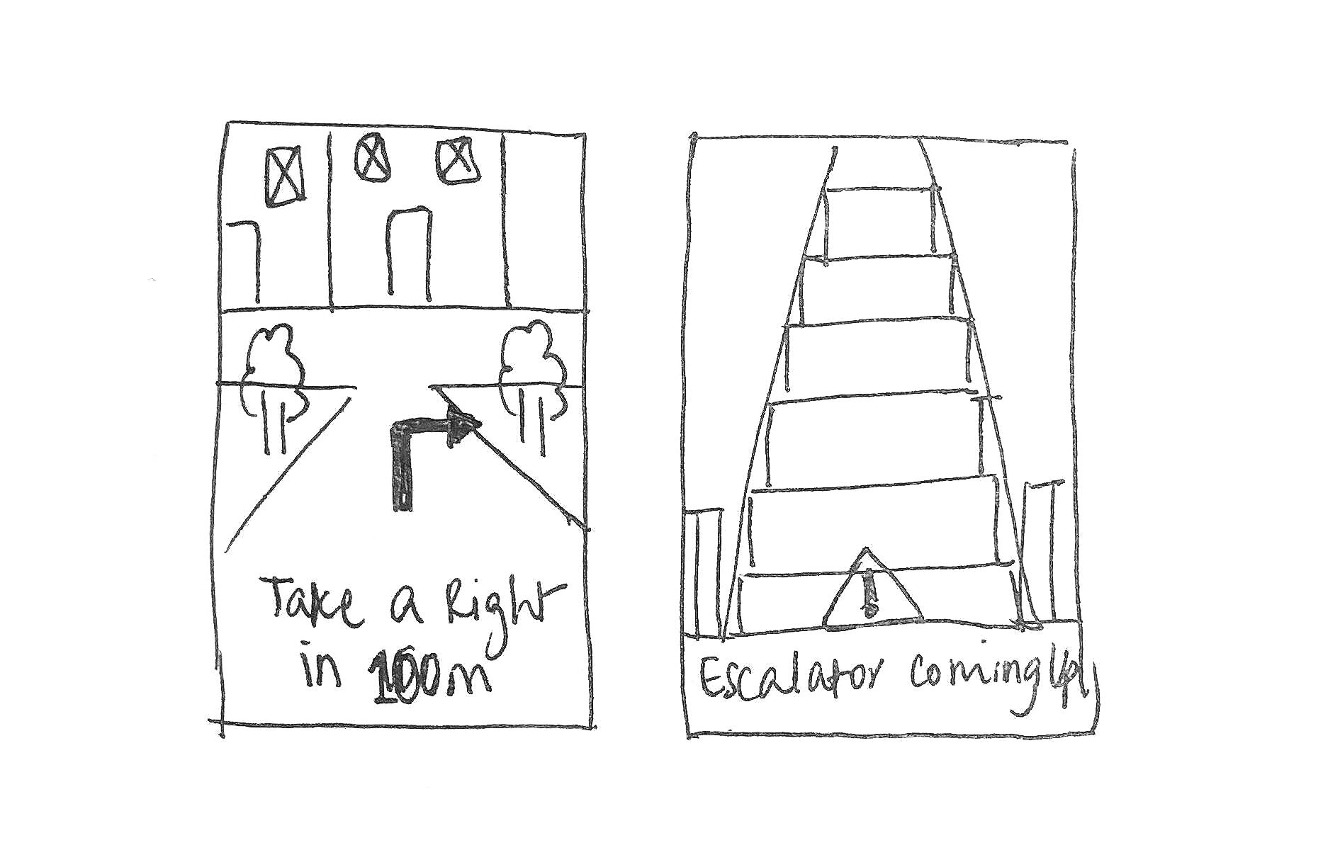
“
I prefer to stay clear of public transports and large open spaces because it’s really difficult to find my way.”
“
There aren’t a lot of apps to help with navigation. I don’t think I would even use one while walking as it could be tougher to not bump into thing.”
Technology Support
“
Google’s TalkBack or Apple’s Accessibility feature helps to use the mobile”
“
Many apps have meaningless accessibility labels so it is hard to identify elements.”
DESIGN ITERATIONSUnderstanding how the target group utilize assistive technology
BRAINSTORMINGIdeating on different accessible interface layouts

COMPARATIVE ANALYSISSo how is this different from other apps?

Interface Design
Apps like Seeing AI is not very accessible since it has a vertical scroll and that requires the user to use to fingers to see all their options.
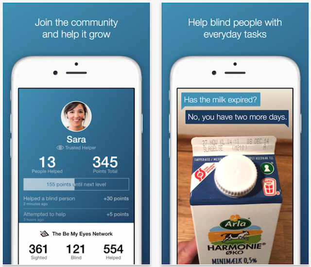
Accurate & Quick Results
Most apps take a while to provide the user with results of their object identification. They also may not be very accurate.
BRANDINGIntroducing the logo
The logo was curated using the name of the app, “Sight-Aid” written in braille.

PERSONAL REFLECTIONS📝 Research to inform your designs
This was also the first time I conducted user research and needless to say it was so much fun! I had the opportunity to talk to people about the problems they face on a daily basis. It was reassuring to hear that my product helped solve some of these problems.
😱 Importance of user testing
This project taught me the importance of user testing. I had no idea that sliders are not accessible elements and if I had not tested, I would have gone ahead with that design.

For this project, I was awarded the 🏆 Link Tutor Prize for Best Overall Student in Digital Media Design.
DESIGN RATIONALEMost important part of the design process
UP NEXT …
Frost Bite →
A branding and packaging design for a bakery proposition for a client who is currently a home-baker